Google launched an update today that favors mobile-friendly sites. This means that people who use Google to search on their smartphone may not find many of their favorite sites at the top of the rankings. More importantly, if your site is hard to navigate on a mobile device, it will most likely be ranked far lower, which in turn could mean a huge loss of leads and business.
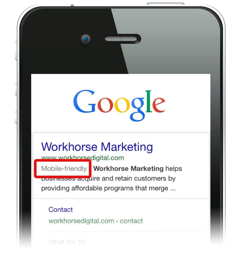
How do you know if your website is deemed mobile-friendly by Google?
Take out your smartphone, go to Google and type your business name into the search field. Assuming your website is optimized for branded terms (ie – your business or product name), it should appear toward the top and it will have a “mobile-friendly” tag, if your website is indeed mobile-friendly.
Further, you can also use the Google Mobile-Friendly Test tool.
Why is Google doing this?
According to a statement by Google, they want consumers to “find content that’s not only relevant and timely, but also easy to read and interact with on smaller mobile screens.”
The update will not affect searches performed from desktop.
Workhorse Marketing has been exclusively designing and developing mobile-friendly websites for over 2 years. We’re here to help. Please contact us for a free consultation.
About Us
Workhorse Marketing is a full-service marketing agency. Headquartered in Austin, Texas, the agency boasts an in-house team of 16 strategic marketers, graphic designers, web developers, social media managers, digital marketers, and interactive producers. Workhorse is focused on providing results based marketing projects, programs and services to a growing client base of more than 130.


